- Published on
Layouts Part III: The Beauty of Layout Weight and Conclusion
*DRAFT*
- Authors
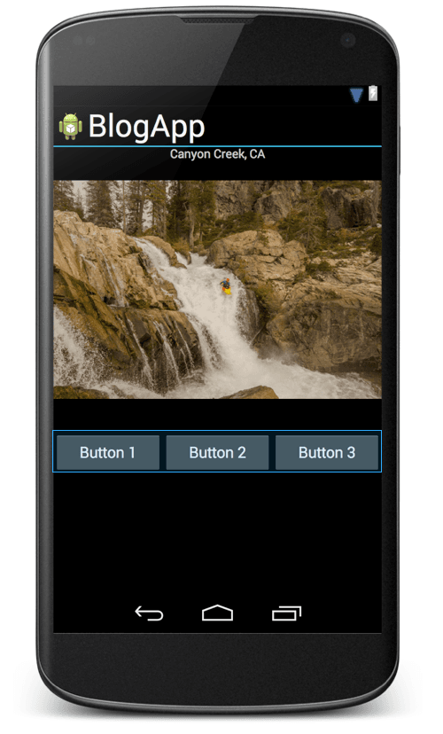
Android's power doesn't stop at just add/remove/collapse. Let’s take the view from the previous post one step further by replacing the single button with a row of three equally sized buttons. In Android, I can embed three buttons in a horizontal LinearLayout. Android provides a convenient attribute, layout_weight that dictates how elements of a layout expand to fill empty space. The weight of the current view divided by the total weights in the layout equal the percent of the layout that the view will take up. To get all of the buttons to be the same width, taking up the whole width of the screen, I simply set all of the layout_weights to be equal, and the layout_width of each button to be "0dp," like so.
<LinearLayout xmlns:android="http://schemas.android.com/apk/res/android"
                  android:orientation="horizontal"
                  android:layout_width="fill_parent"
                  android:layout_height="wrap_content">
        <Button
                android:layout_width="0dp"
                android:layout_height="wrap_content"
                android:text="Button 1"
                android:layout_weight="1"/>
        <Button
                android:layout_width="0dp"
                android:layout_height="wrap_content"
                android:text="Button 2"
                android:layout_weight="1"/>
        <Button
                android:layout_width="0dp"
                android:layout_height="wrap_content"
                android:text="Button 3"
                android:layout_weight="1"/>
    </LinearLayout>
Now let's say I only want the three buttons to take up part of the screen. In Android, I simply resize the LinearLayout, and everything else happens for free. On a whim, I've also centered the whole button layout with the layout_gravity attribute. It's that easy.
<LinearLayout xmlns:android="http://schemas.android.com/apk/res/android"
                  android:orientation="horizontal"
                  android:layout_gravity="center_horizontal"
                  android:layout_width="200dp"
                  android:layout_height="wrap_content">

Android button layout, before and after resizing
Let's say I want the middle button to be twice as big as the other two buttons. Simply change the weight of the middle button to 2 instead of 1. It's a one character change.
        <Button
                android:layout_width="0dp"
                android:layout_height="wrap_content"
                android:text="Button 2"
                android:layout_weight="2"/>

Let's say I want to move these buttons to reside above the picture. Because all of the information for this layout is contained inside the LinearLayout xml tag, I can simply cut/paste the whole LinearLayout. Likewise, I can cut/paste to move the layout to another view entirely. As you can see, this abstraction allows for an incredible amount of flexibility, and is extremely powerful. It successfully hides much of the complexity around layouts, allowing a developer to focus on building beautiful views. And, for all the cases that Linear Layouts can't handle, Android provides two other awesome layout classes, RelativeLayout and FrameLayout. I'll discuss them in a future blog post.
It's a different story in iOS. A button layout with the type of flexibility I demonstrated on Android is difficult or impossible to reproduce. There are ways to hard code, or semi-hard code the layout, but the result will not be flexible or robust against certain design changes. It's enough of a pain to try to recreate on iOS that I'm going to leave it to a future blog post, if there's enough interest. Or if someone has a brilliant, simple way, I'm all ears.
To summarize, the fundamental mistake in iOS is a lack of a coherent abstraction. Constraints are very low level building blocks for views, and they often do not represent the fundamental tasks that a developer is trying to accomplish. So, the developer has to spend a lot of time and energy translating desires like, "I want a couple of buttons on screen that expand on rotation," into this language of constraints. It's time consuming, brainpower intensive, and is a distraction from the business logic of the app. Also, the developer usually has to choose between multiple ways of accomplishing their task, none of them simple. Thus, different code bases will often handle views differently, and even different developers in the same codebase will use different paradigms. This inconsistency leads to complicated, asymmetric view hierarchies.
On the other hand, by providing layout abstractions, Android has managed to hide much of the complexity surrounding views. Developers can focus on making the important decisions like how a view should behave on rotation and how elements should resize on larger screens. Also, by providing readable xml, Android has successfully encapsulated the relevant attributes of each view element, which keeps the code organized and helps developers design views that can be easily moved, reused, and even subclassed. When I'm building an iOS app, I usually plan to spend the bulk of my time on layout. In Android, layouts are often less than 25% of my time. So, in the future, with Android as an example, I would like to see Apple introduce layout abstractions to reduce complexity in iOS app views.