- Published on
Layouts Part I: Android > iOS
*DRAFT*
- Authors
In this series of blog posts, I'm going to discuss the view layout systems in iOS and Android. I will show that basic tasks are easier in Android because the platform provides useful layout abstractions that encapsulate and hide much of the complexity around defining a view. Also, by providing readable xml layout files, Android allows developers to create organized, reusable, and flexible layouts. On the other hand, iOS's constraint system is too low level, and so developers can quickly find themselves mired in a web of constraints. The resulting views are difficult and tedious to change, and do not offer the same power and flexibility as Android layouts.
The Basic Layout
Let’s build a simple view with a text field, an image, and a button, one after another. In Android, all I have to do is make a Linear Layout, insert the three items in the order I want them to appear, and voila!
<LinearLayout xmlns:android="http://schemas.android.com/apk/res/android"
                             android:orientation="vertical"
                             android:layout_width="fill_parent"
                             android:layout_height="fill_parent">

<TextView
        android:layout_width="fill_parent"
        android:layout_height="wrap_content"
        android:text="Canyon Creek, CA"/>

<ImageView
        android:layout_width="fill_parent"
        android:layout_height="wrap_content"
        android:src="@drawable/CanyonCreek"/>

<Button
        android:layout_width="wrap_content"
        android:layout_height="wrap_content"
        android:text="Button 1"/>

</LinearLayout>

On iOS, the basic view setup is also quite easy. I’m going to use Interface Builder whenever possible because it is Apple's preferred view construction tool and because I find the code constraint language to be obtuse and unreadable. To obtain the same view we built in Android, you simply drag the elements you want onto the screen. Here’s an example.
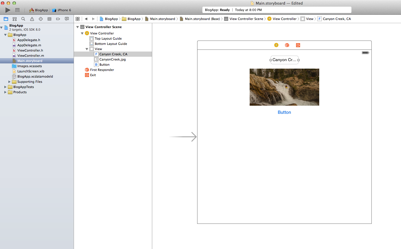
Note that auto layout will automatically infer a set of constraints to define how the view should change on rotation or resize. One can build an app without ever touching constraints, which is handy for prototypes. However, in my experience, the resulting view usually has a few bugs. Also, auto layout does not afford pixel control over the spacing, widths, and heights. So, to make a more professional layout, I'm going to add constraints. I will not go into detail here; there are a number of existing tutorials on how to use Interface Builder.
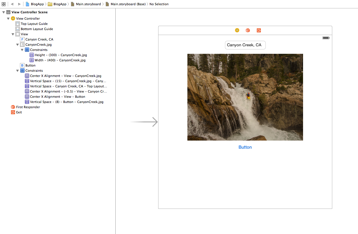
I had to add eight constraints to do what Android did for free, adding significant complexity and code bloat. As a view gets more complex and the number of constraints multiplies, this system quickly becomes unwieldy. It can be really difficult to determine how a view element's position is being defined when there are dozens of constraints, and other elements are being dynamically resized.
Also, with so many constraints floating around, there are numerous ways to constrain the view, and the developer is responsible for choosing the best one. For instance, to center each view, I chose the “Center X Alignment” constraint relative to the parent view. But, I could have defined the horizontal position of each view as a distance from the left margin, or I could have chained the Center X Alignments together, so that each view is center aligned with the one above it. I chose relative to parent because the simplest layouts use constraints that are defined relative to the parent view whenever possible. That way, constraints are not chained off of other elements in the view, and it is easier to add/remove views. Regardless of the choices you make, constraints require a fair amount of thought, and can be very time consuming to get right.
In contrast to the web of constraints in iOS, the readability of the Android xml layout file allows me to use simple attributes to build clean, easy to follow, and encapsulated view elements. For instance, I can use fill_parent on the width and height attributes of the LinearLayout to fill the screen, and set margins on the text view and button to fix some spacing issues. I also can set the source file and the scaling type for the image view. All of these attributes reside inside the xml tag, where the they are easy to find and understand.
<LinearLayout xmlns:android="http://schemas.android.com/apk/res/android"
                             android:orientation="vertical"
                             android:layout_width="fill_parent"
                             android:layout_height="fill_parent">

<TextView
        android:layout_width="fill_parent"
        android:layout_height="wrap_content"
        android:layout_marginTop="15dp"
        android:layout_marginBottom="15dp"
        android:gravity="center_horizontal"
        android:text="Canyon Creek, CA"/>

<ImageView
        android:layout_width="fill_parent"
        android:layout_height="wrap_content"
        android:gravity="center_horizontal"
        android:scaleType="fitCenter"
        android:src="@drawable/CanyonCreek"/>

<Button
        android:layout_width="wrap_content"
        android:layout_height="wrap_content"
        android:layout_marginTop="15dp"
        android:layout_gravity="center_horizontal"
        android:text="Button 1"/>

</LinearLayout>

The one quirk I will note about this view is the use of gravity vs. layout_gravity. gravity dictates the placement of the elements of a view inside its frame, while layout_gravity controls the placement of a view's frame within its parent. For instance, with a button, gravity affects the placement of the title text within the button, while layout_gravity affects the placement of the button in the parent linearLayout. So, layout_gravity centers the button.